Buttons
The Buttons panel is for exactly what you’d think it’s for. Every button that LearnDash uses, as well as those used by the third-party plugins that we support, will inherit the styles you set here. I’ll explain the difference between Primary & Standard buttons, as well as provide examples of each.
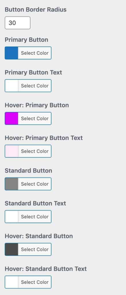
Button Border Radius
The Button Border Radius is defined in pixels, and it is used for ALL LearnDash buttons. The default is 24px, which is used by LearnDash. Leave it blank to use the default, or enter your own value.
Primary Buttons
We define Primary Buttons as those that indicate the primary action on a page or in a particular section of your site.
Examples of primary buttons include:
- Mark Complete at the bottom of a page
- Login / Logout (when the LearnDash login block/shortcode is used)
- Search (when search is enabled on the LearnDash Profile block/shortcode)
- Post Comment (when comments are enabled in focus mode)
- Take this Course (on course pages, when a default LearnDash payment method is being used)
- See more… buttons on the course grid
- Many other primary buttons included with the third-party plugins that we support
Standard Buttons
Quite simply, every button that is not a Primary Button is a Standard Button. These are buttons that denote page actions, navigation, etc., but are usually not the first button your students will use to take an action on a page.
Examples of standard buttons include:
- Previous Lesson / Next Lesson
- Expand All / Collapse All
- Many other standard buttons included with the third-party plugins that we support
Hover Styles
Hover styles for all buttons are prefixed with Hover:. You can set hover styles for both primary & standard buttons. The hover state occurs when a mouse hovers over a button, or when a button is tapped on a touch-enabled device.
Other Notes
- The buttons on the LearnDash login/registration modal popup do not use these styles. Their styles are determined by settings on the Login & Registration panel.
- The button colors inside of alert messages are determined on the Alerts panel.