Login & Registration
The login & registration modal settings apply to the popup modal that appears when a visitor goes to either log in to your site, or register for free, to gain access to a course.

NOTE
You must enable this setting in LearnDash in order to use it, and take advantage of our design options.
To enable it…
- Navigate to LearnDash LMS > Settings
- On the General tab, scroll down to Login & Registration
- Enable the setting
- Click the “Save” button

Previewing the Modal
This popup modal is mainly used for logged out visitors, and those who don’t yet have access to a course. As an administrator, you are already logged in, and by default, you have access to all courses. There are a few ways you can preview what this modal looks like.
As a logged out user
The easiest way to see this modal in action is to use a private browsing window, or a different browser, that you are not logged into your site with. This will allow you to experience your site as if you were a visitor. You can then go through the process of logging in via the modal.
Disable course auto-enrollment admin setting
Another option is to disable the course auto-enrollment option for administrators. This setting is found on the LearnDash LMS > Settings page, on the General tab.
- Under Admin User Settings, disable the “Course Auto-enrollment” setting
- Make sure you are not enrolled in a course
- View that course on the frontend of your site
- If the course has the appropriate access settings, you will see a button to login to enroll
Login & Registration Settings
Now let’s go through all of the settings. Here’s a quick visual overview:
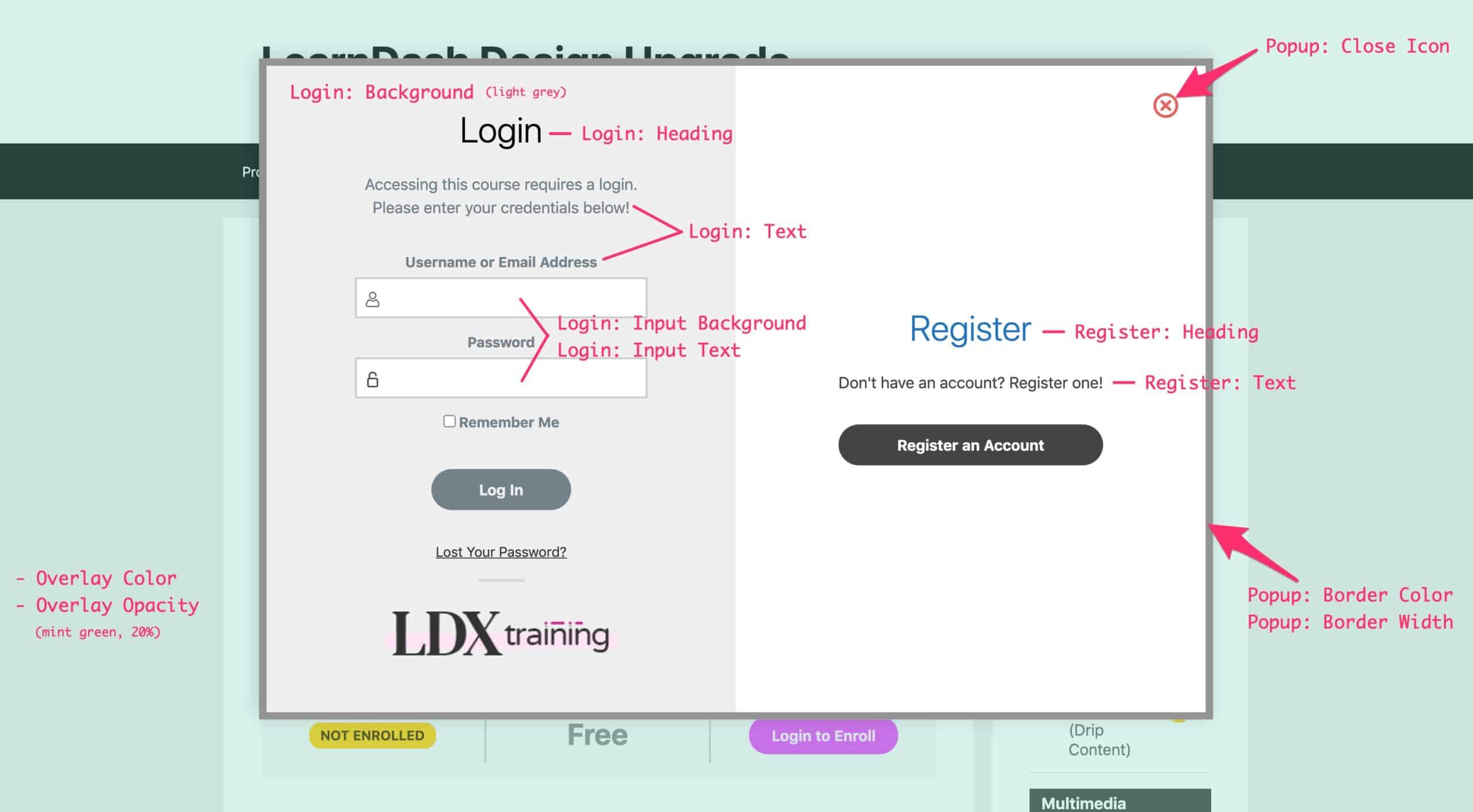
Popup Overlay
By default, LearnDash does not add an overlay color to the window surrounding the modal. Our plugin adds this overlay, and allows you to modify the color & opacity. Both of these options are experimental but should work on most modern browsers.
- Overlay Color: The color used to fill the page behind the modal
- Overlay Opacity: The level of opacity that is applied to the overlay color. A value from 10-90% may be chosen, in 10% increments. Default
70%. The lower the number, the more see-through the color.
Popup Container
These 3 styles apply to the actual popup that appears in the center of the screen. The popup contains the login information & form, and if you have registration enabled, an additional registration panel.
- Popup: Border Width: The width, in pixels, of the popup’s border. Enter a value of
1or higher. No border is applied by default. - Popup: Border Color: The color used for the popup’s border. A border width must be set for this option to take effect.
- Popup: Close Icon: The color used for the close icon in the top corner. 70% opacity is used by default, and the full color gets applied on hover. Default is
#728188, or#ffffffwhen the register panel is enabled.
The entire popup container will inherit the Global Border Radius from the General Design panel.
Login Panel
The login panel refers to the entire area that contains all of the login information inside of the popup. This includes the “Login” title at the top, the username & password fields, the “Log In” button, “Lost Your Password?” link and logo at the bottom, if you’ve uploaded one.
If you are not allowing free registration, this is the only panel that will be visible. If you’ve enabled free registration, see the next section for “Register Panel” styles.
There are 7 options to customize for the login panel (reference the image above for a visual):
- Login: Background: The background color for the entire login panel area
- Login: Heading: The text color of the word “Login” at the top of the panel
- Login: Text: The text color of the words just below the “Login” heading
- Login: Input Background: The background color of the username & password fields in the login
<form> - Login: Input Text: The text color of the username & password fields in the login
<form> - Login: Remove description text: Enabling this option will remove the description text found just beneath the “Login” heading
- Login: Remove logo: Enabling this option will remove the logo from the bottom of the login panel
The “Log In” button will use the login background & text colors. We invert the colors so the text becomes the button background & the overall background becomes the button text.
- Login: Text = Button Background Color
- Login: Background = Button Text Color
Register Panel
The register panel refers to the side of the popup where users can register for a free account. When enabled, this is displayed next to the login panel. Register panel not showing? See this help article →
Many of the same options available for the login panel are also available for the register panel. See “Login Panel” above for a description of features.
In addition, you can hide two pieces of text that normally appear on the “Register” panel:
- Register: Remove description text: Enabling this option will remove the description text found just beneath the “Register” heading

- Register: Remove email confirmation text: Enabling this option will remove the “Registration confirmation will be emailed to you.” message above the “Register” button. (Why hide this? Upon successful registration, a different thank you message is shown to the user instructing them to check their email.)

The “Register An Account” & “Register” buttons will use the register background & text colors. We invert the colors so the text becomes the button background & the overall background becomes the button text.
- Register: Text = Button Background Color
- Register: Background = Button Text Color
Other Notes
- All of the buttons (“Login,” “Register an Account,” and “Register”) will inherit the Button Border Radius from the Buttons panel
- On hover, all buttons receive a 4px, 92% transparent black shadow
- LearnDash adds a slight box shadow on the popup. We do not alter this, and don’t provide any options for changing it.